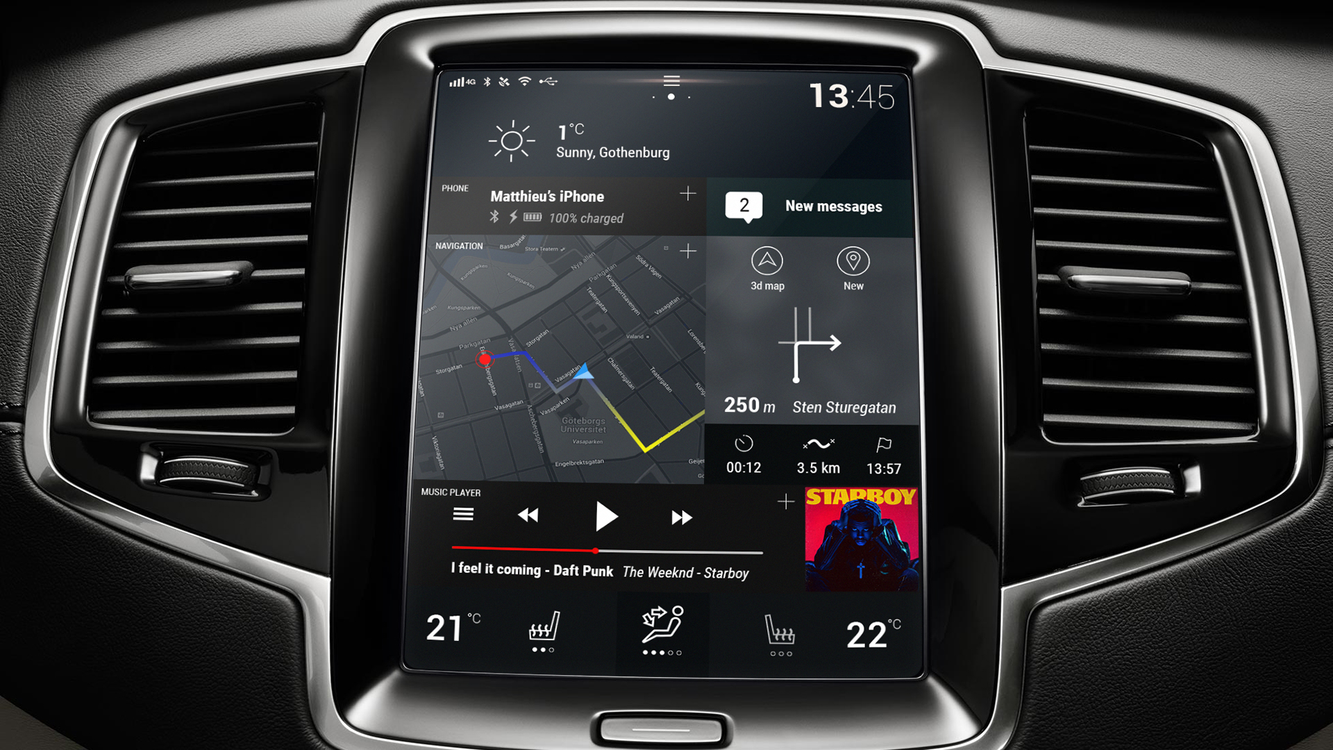
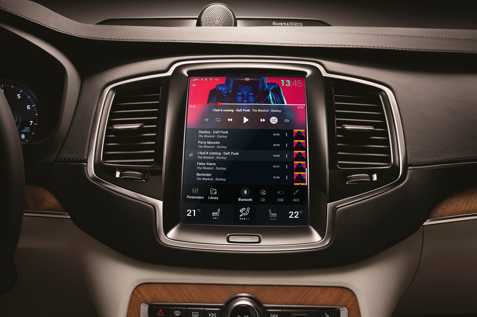
The Sensus experience on a gorgeous 9-inch portrait screen
The Volvo Sensus system offers a great user interface and maybe one of the best in the market,
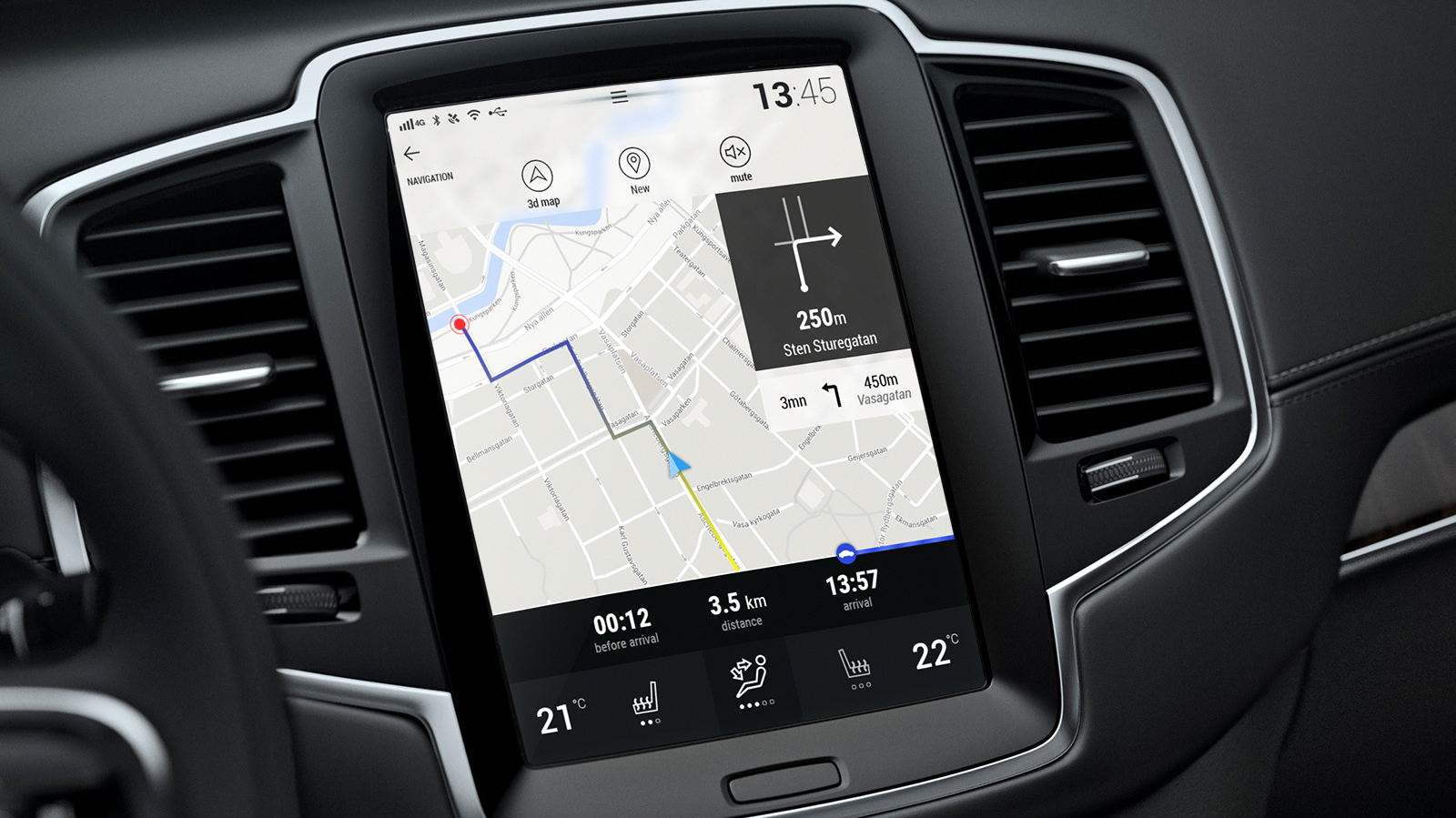
but there might be still some room for improvement. The Home Screen offers an overview of the
main functions, the connected phone, the navigation, the music player. At the bottom, we have
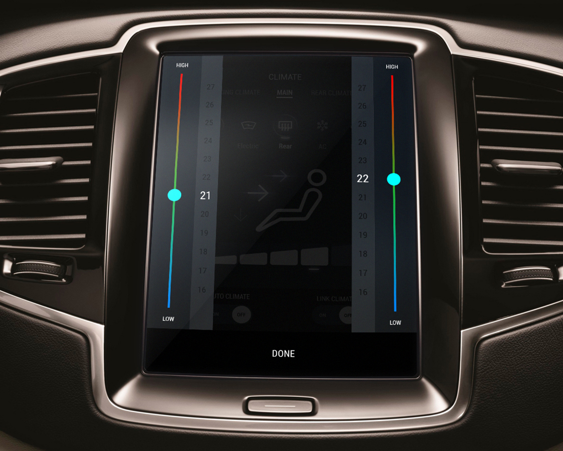
the temperature controls, which stays always accessible as it is a primary function. The Home
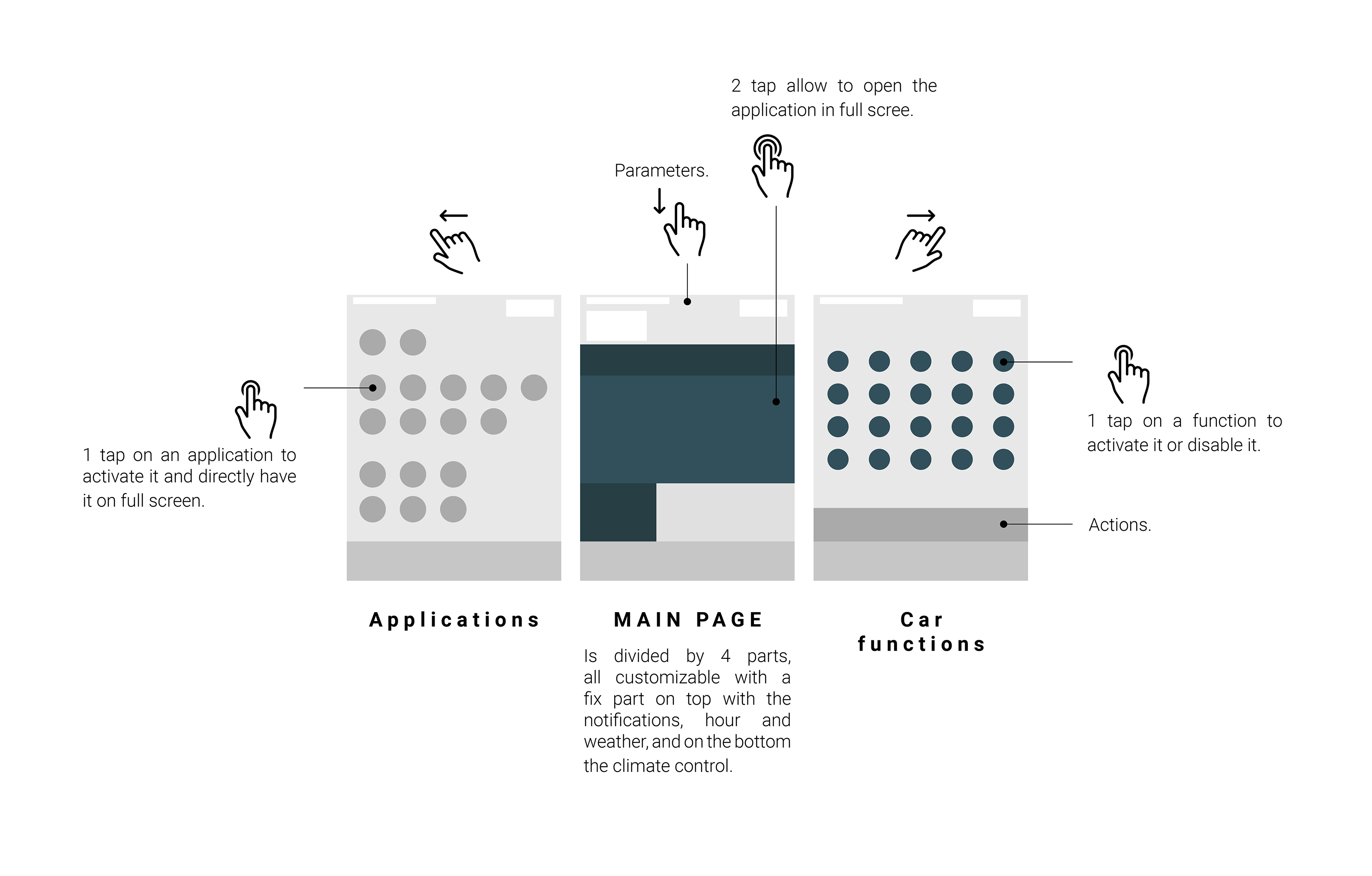
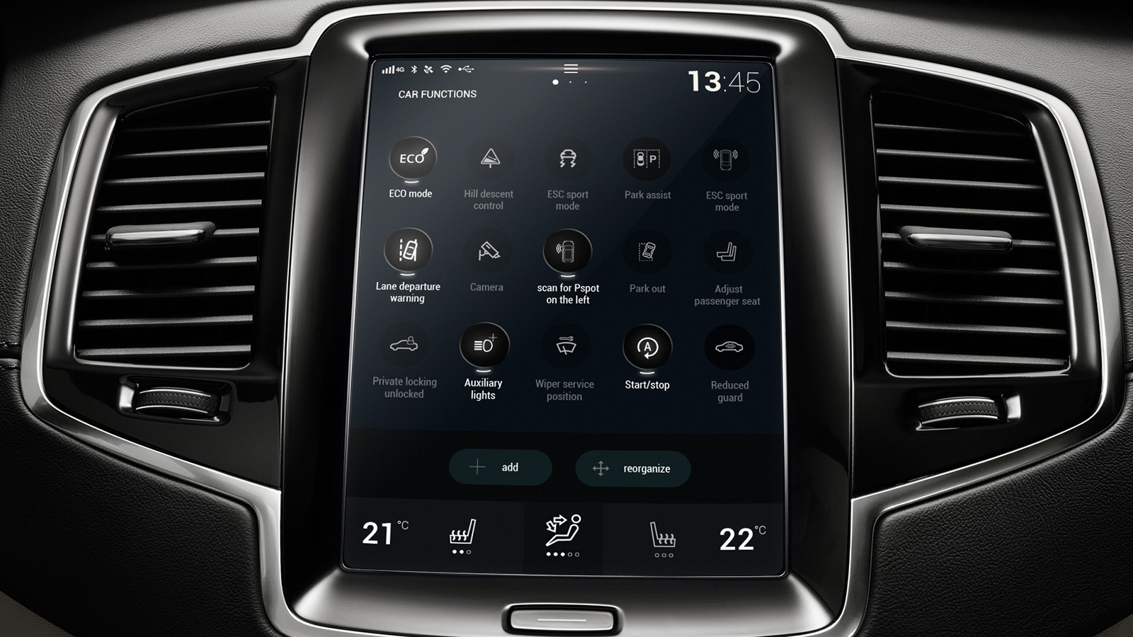
Screen can be scrolled vertically, to the left: the car functions, to the right: the car applications.
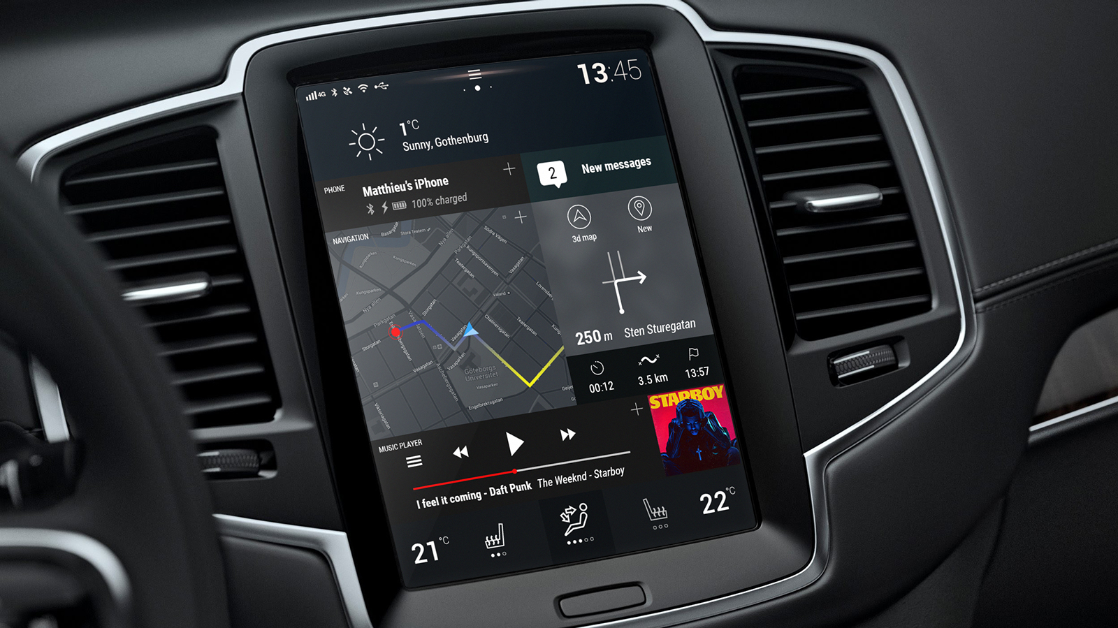
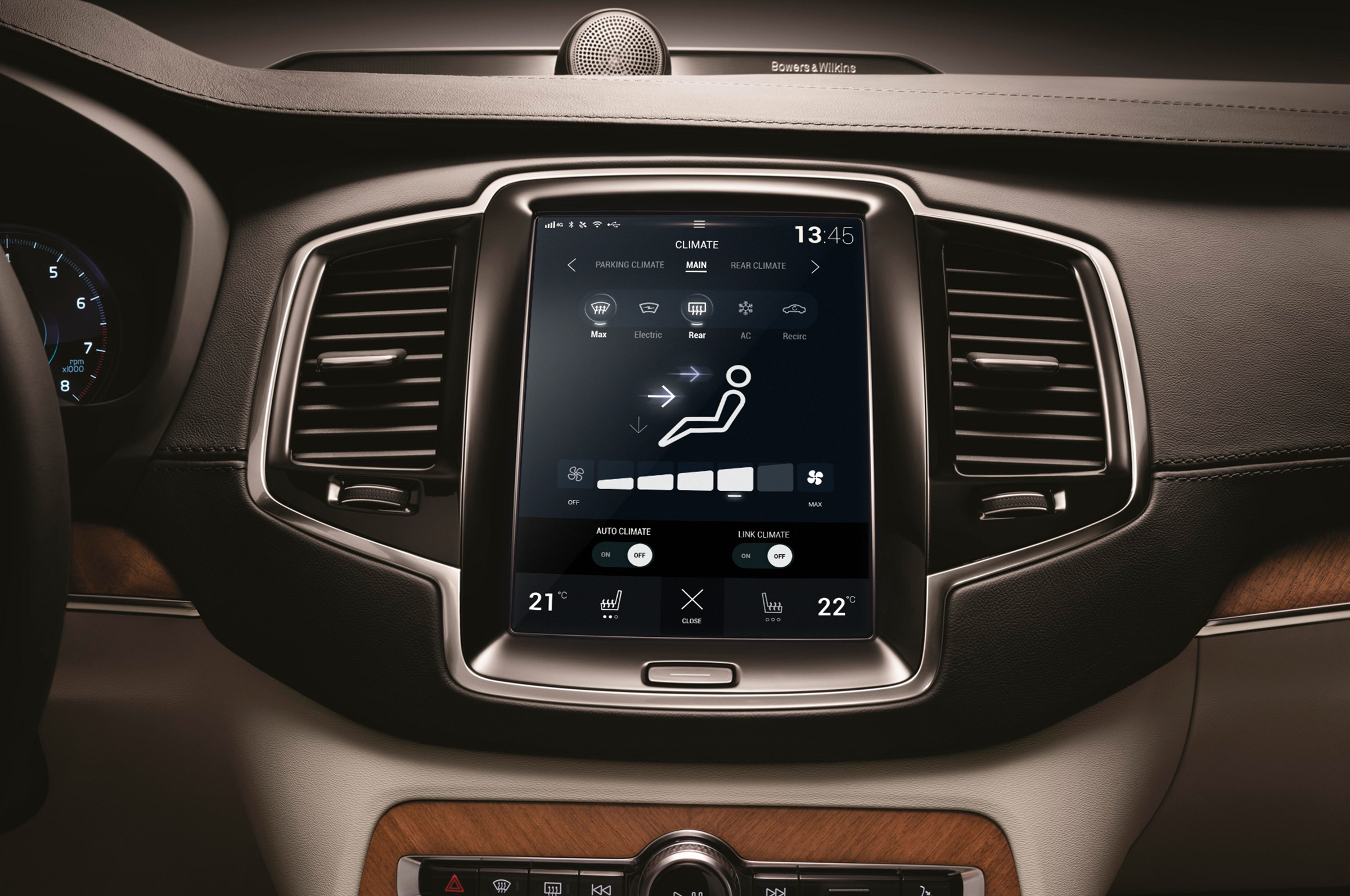
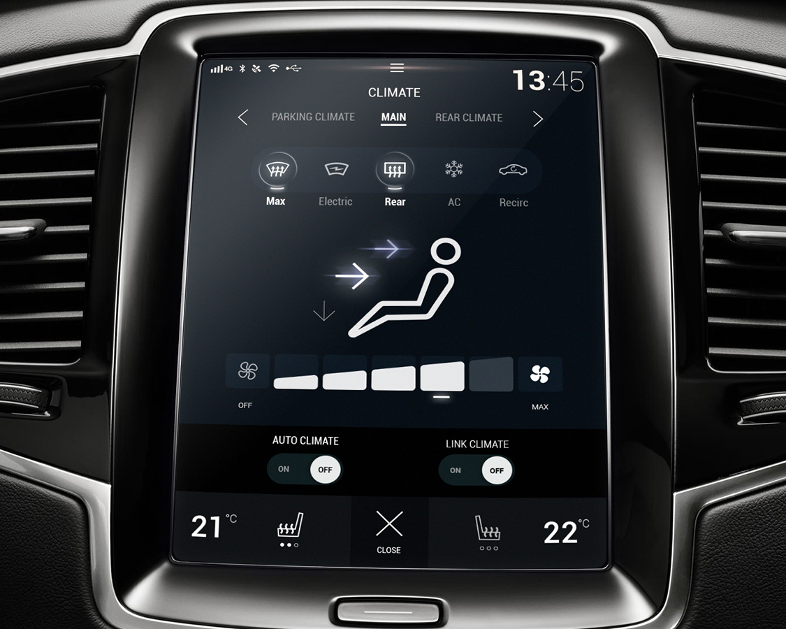
The Home Screen provide more control on the primary information
The Home Screen provide more control to the user and make it possible to display more
information at one time while keeping a clear overview of what is happening. Also reduce
the amount of tapping in and out to make adjustments.